
McDonald's App
Summary
Taiwan’s food culture is vibrant and ever-present — it’s nearly impossible to walk down the street without encountering something delicious. In a place where food is everywhere, why would anyone choose McDonald’s?
The answer lies in convenience. McDonald’s is a time-saver — a go-to for quick, affordable meals. Its core customers are young urbanites, especially students and salaried workers, who value speed above all.
According to the latest National Statistics (ROC Taiwan), 5.6 million young adults (ages 15–39) live in Taiwan’s six central municipalities — a major market for fast food.
As one of them, I noticed a recurring issue: long queues at McDonald’s during peak hours, undermining its “fast food” promise. This disconnect erodes trust and impacts both customer experience (CX) and sales.
This project started with a simple question:
How might we reduce ordering time at McDonald’s and restore its image of convenience?
Is there a solution that could streamline the experience, delight customers, and ultimately boost revenue for McDonald’s Taiwan?
Problem Hypothesis
Customers at McDonald’s Taiwan face several friction points that undermine the brand’s promise of convenience: long queues during peak hours lead to walkaways; self-service kiosks lack privacy, creating discomfort and pressure; both kiosks and cashiers induce a sense of urgency due to public visibility and decision fatigue; and finally, popular discounts—key to customer retention—can’t be redeemed at kiosks, making the experience feel incomplete.
Making Assumption

Based on research insights, I assumed that McDonald’s customers value customization, prefer to take their time when deciding on their orders, and appreciate a sense of privacy during the process. They also want a convenient way to order, redeem rewards, or top up their loyalty cards without having to wait in long lines.
Analysis

Online research across articles, forums like PTT and Dcard, and user discussions revealed recurring issues: McDonald’s self-service kiosks don’t support deals or rewards, limiting their usefulness and creating extra work for staff. As they’re only accessible in-store, only about 30% of customers can use them. Their large 40-inch screens, often viewed from just 15–30 cm away, exceed the human peripheral range and compromise privacy, making users feel exposed. Customers also express frustration with managing rewards in the app and note legibility issues with the new digital menus at the cashier.
UXR

To validate my hypotheses, I conducted informal interviews over coffee with McDonald’s customers, focusing on their motivations, frustrations, and ordering experiences. Common themes quickly emerged: time pressure was a major factor in their decision-making, with many avoiding McDonald’s altogether when lines were visible. Several felt stressed when cashiers or other customers were waiting on them, and noted that customization features, while useful, often slowed down the process. Others expressed disappointment that rewards couldn’t be redeemed at kiosks, forcing them back into queues. Hygiene concerns around shared touchscreen surfaces also discouraged kiosk use.

To quantitatively validate my hypothesis, I surveyed 120 people. The results reinforced key pain points: 92% buy McDonald’s when they need to save time, yet 89% have walked away due to long lines. 74% felt stressed when rewards couldn’t be redeemed at self-service kiosks, as it forced them to queue again. Privacy and social pressure also surfaced—67% felt uncomfortable with others seeing their orders on kiosk screens, and 83% felt pressured when cashiers or other customers were waiting. Interestingly, only 26% were willing to wait in line if they were specifically craving a favorite item like McNuggets or a McFlurry.
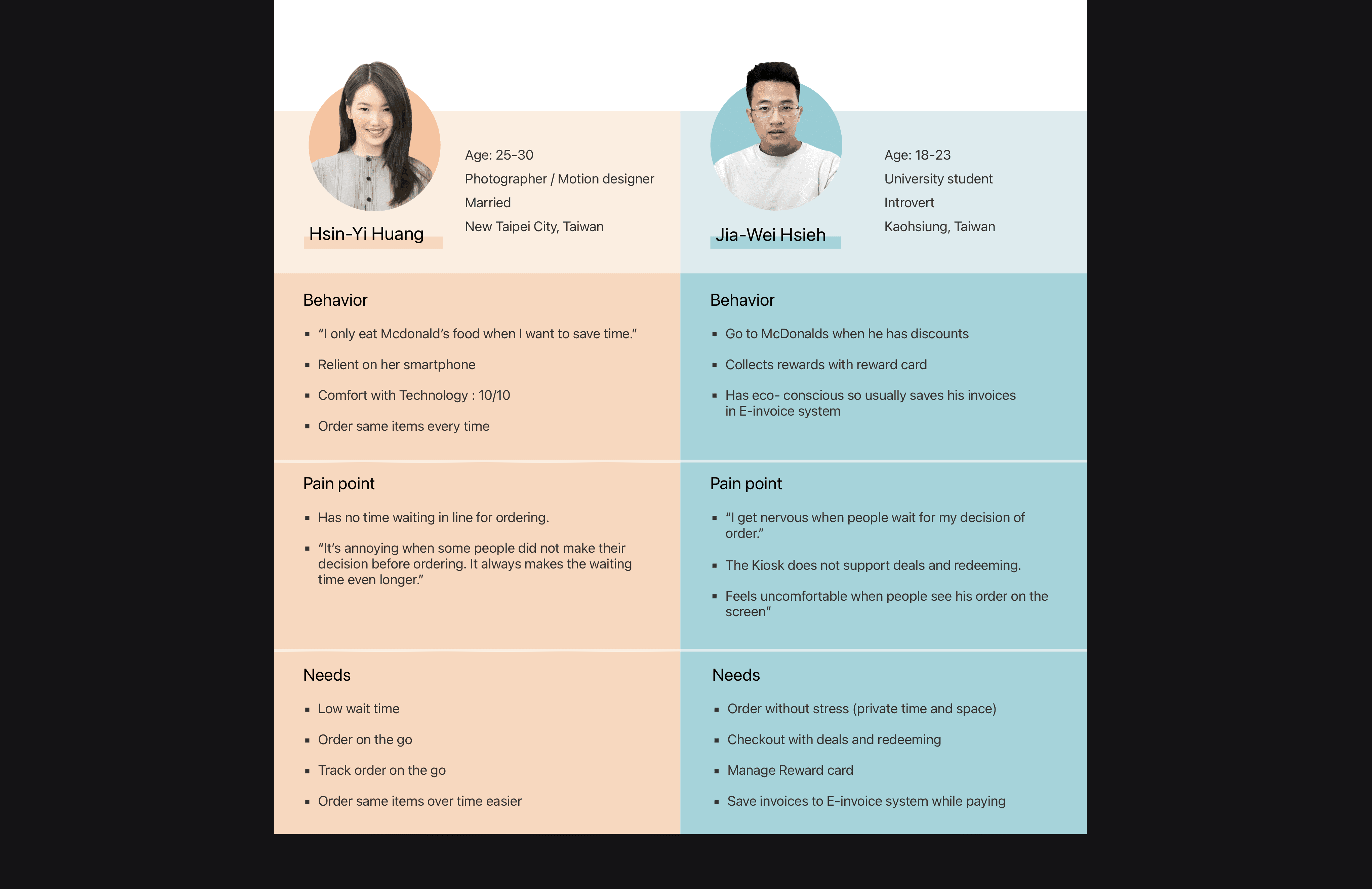
Based on the research findings, I created two distinct personas representing different customer types. These served as valuable reference points throughout the design process.

While personas explain who users are and what they do, job stories focus on context and motivation. I used them to dig deeper into why people act, aiming to understand their situations and desired outcomes more clearly.
Storyboard and Flows

I created two storyboards illustrating how each persona would interact with the product. Given the fast-paced, on-the-go context, a mobile app emerged as the most suitable platform.

Above is the flow I created based on the storyboards.
Wireframes

I built a wireframe based on the user flow, then validated it through static evaluations and markups with potential users. Their feedback guided the next iteration of the design.
Colour Palette

McDonald’s introduced a new corporate identity in 2016, with the FORM style being most common in Taiwan. This style pairs a modern black exterior—used in architecture and logo backgrounds—with light, colorful interiors. To maintain brand consistency, I chose black and yellow as primary colors, complemented by lighter tones reflecting the FORM interior aesthetic.
Final Design
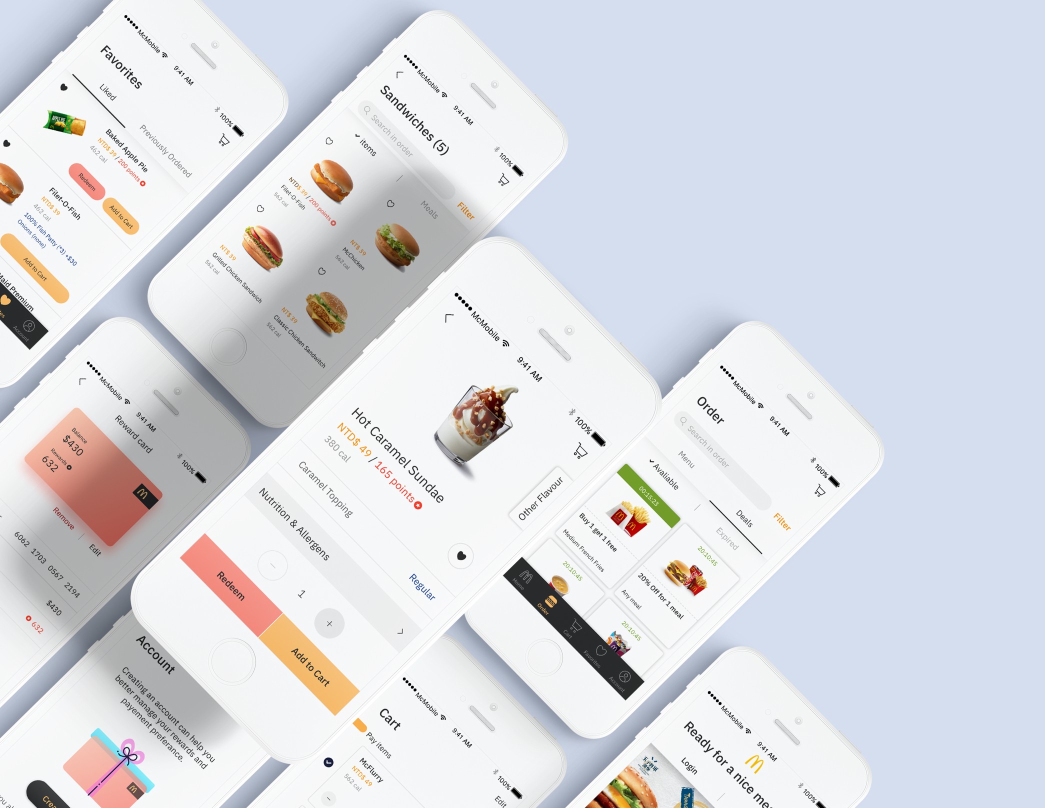
Feature I: Quick order without Login
Mandatory login at launch can deter users, especially those who just want to browse. I wanted users to explore and engage with the app freely before being asked to log in or register. To support this, the login screen appears only at checkout. For added flexibility, a guest checkout option is available for users who want to order quickly without redeeming rewards.


Feature II: Previous & Favorites
For users like Hsin-Yi, who tend to reorder the same items, browsing the full menu each time is unnecessary. To streamline their experience, past orders are automatically saved under “Previously Ordered,” while users can manually save favorites by tapping the heart icon. Both “Liked” and “Previously Ordered” are placed within the “Order” tab for quick and easy access.

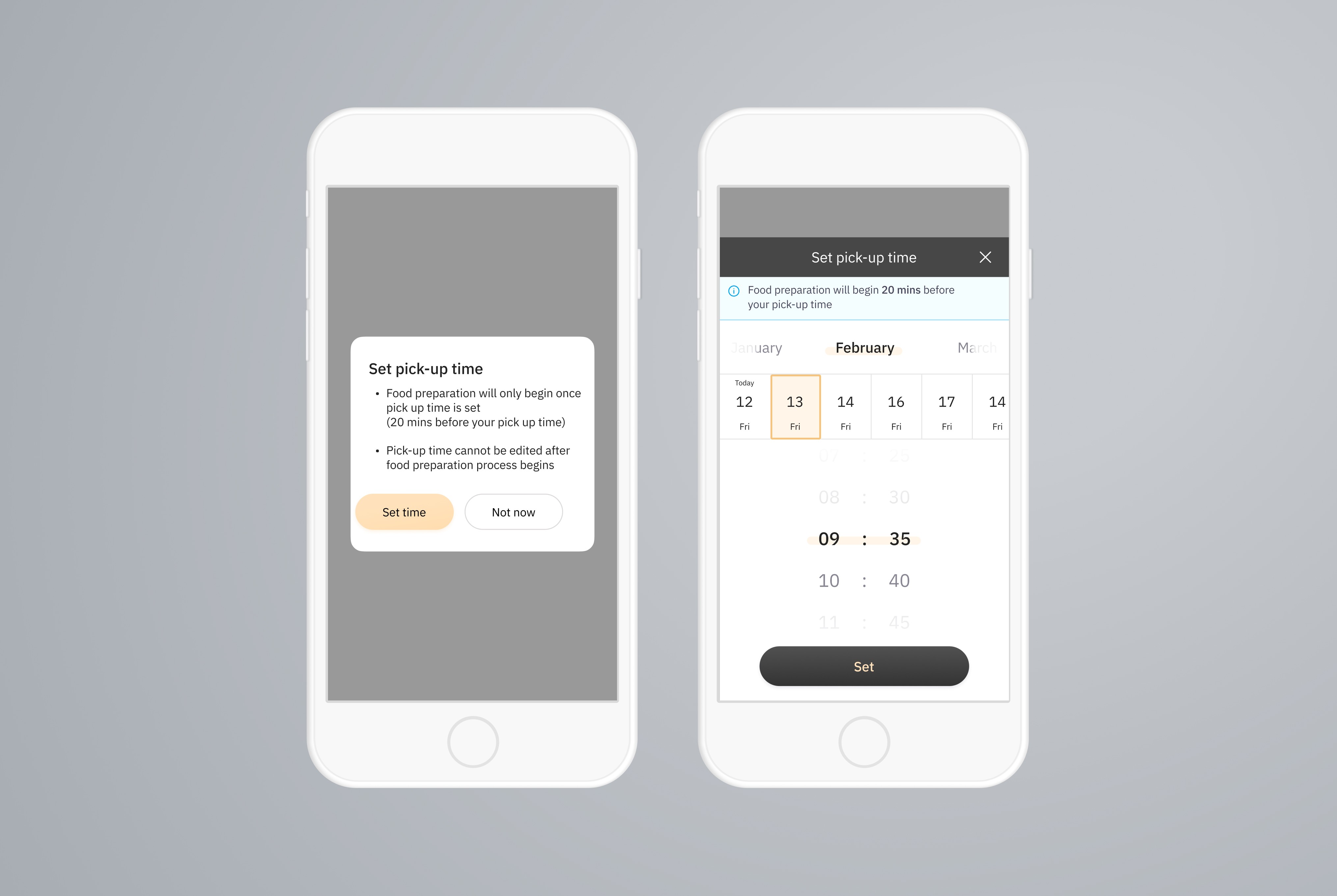
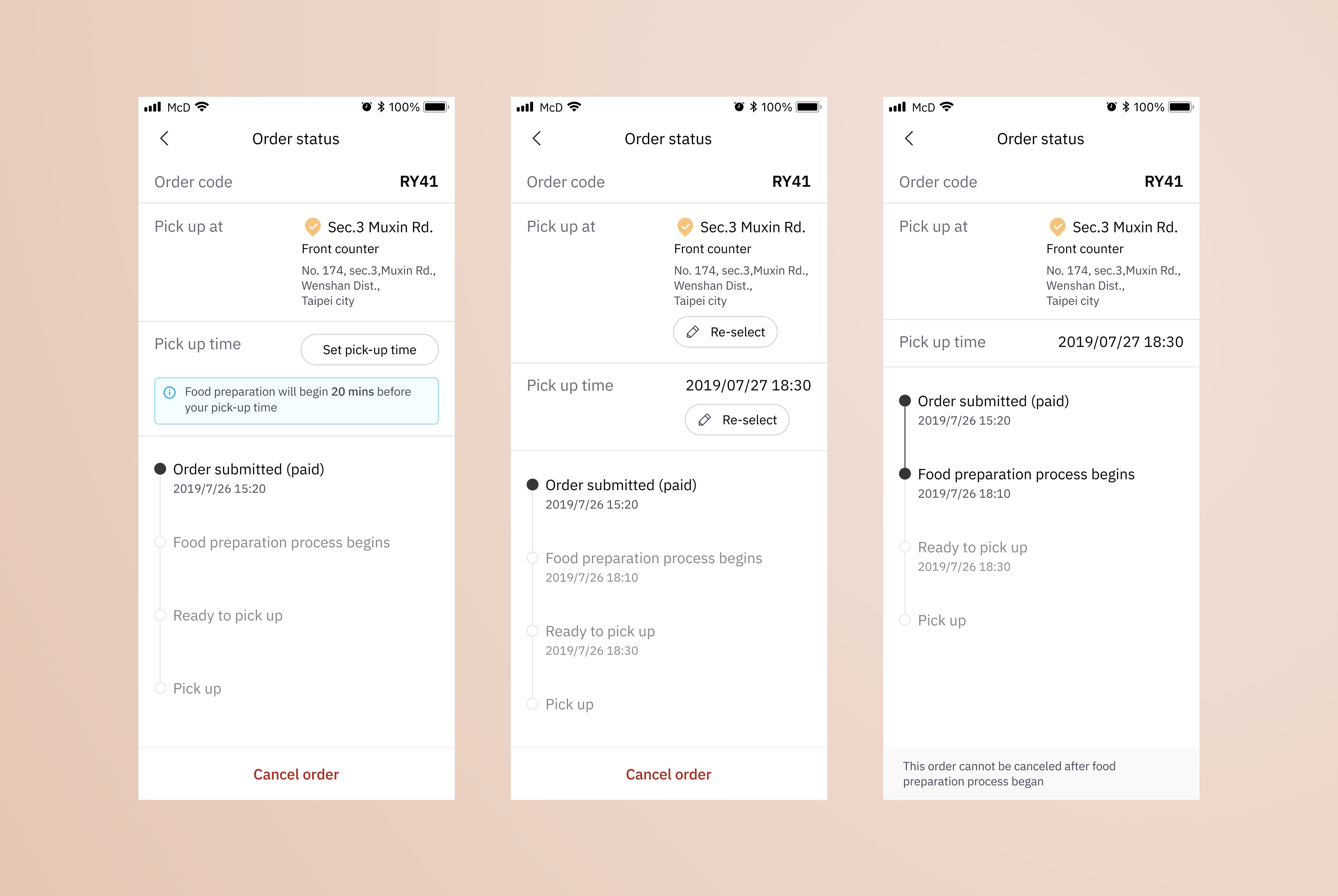
Feature III: Pick-up time Setter & Order Tracker
The pick-up time setter and order tracker help reduce user anxiety by making order status visible through real-time updates and push notifications. They also allow users to place orders before arriving, with the added control of selecting a preferred pick-up time.

Feature IV: Redeeming & Deals
To support deal-seeking users, the app enables discount redemption at checkout. It also includes in-app reward card management, allowing users to view points and top up their cards easily.


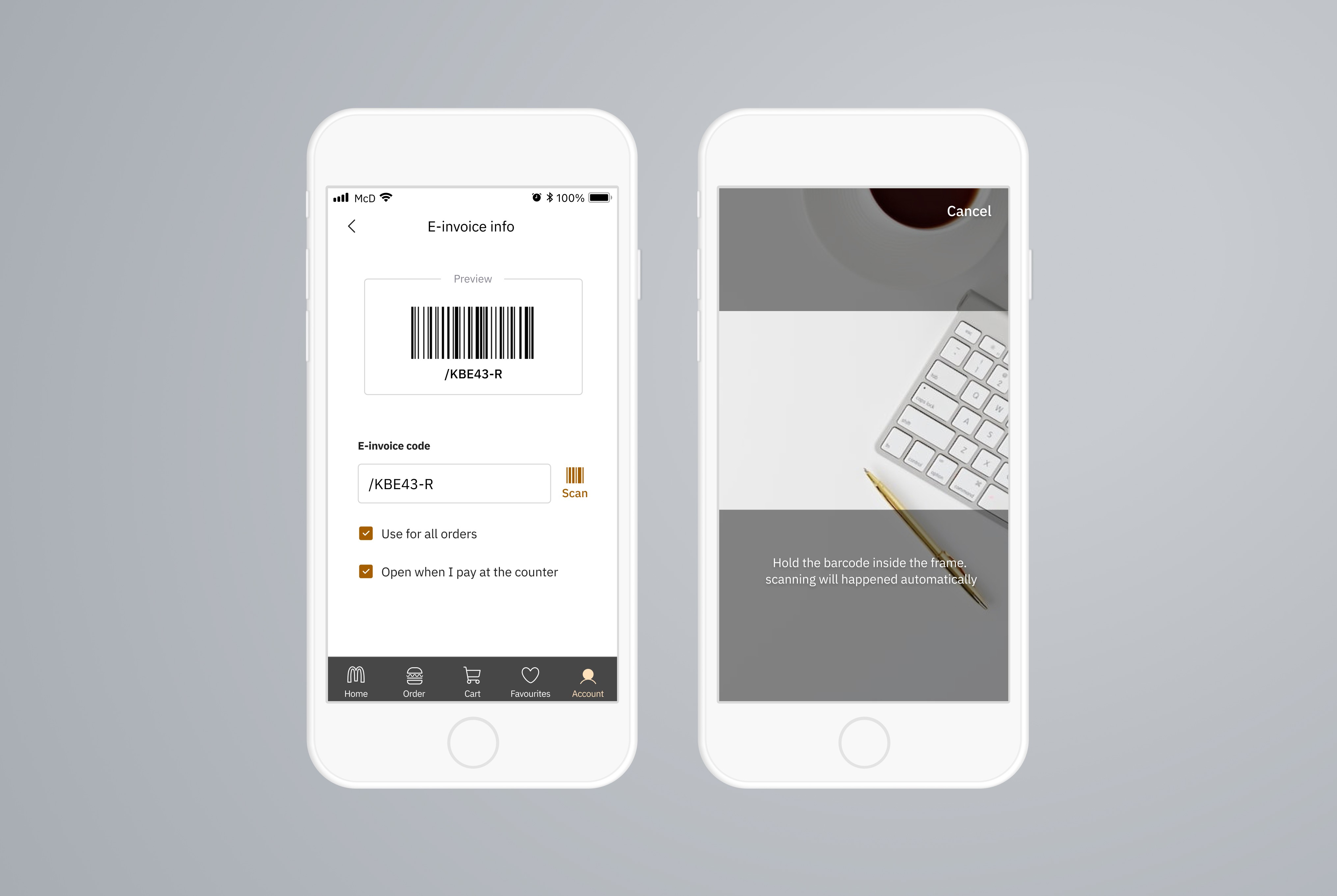
Feature V: Support E-Invoice
In Taiwan, receipts double as government lottery tickets, so users still want them—even though they’re non-recyclable. To offer a more sustainable option, the app supports e-invoice integration, allowing users to enter their account info manually or simply scan a barcode for quick setup.

Feature VI: Search & Filter in Menu
To support users who prefer quick, direct access to items, a prominent search bar is placed at the top of the menu. This reduces browsing time and improves efficiency, ultimately boosting conversion.


Learnings and Reflection
Redesigning the McDonald’s app was both a complex and rewarding experience that deepened my understanding of the UX process. User research revealed a wide range of customer needs and behaviors, which shaped much of the design direction. A key learning moment came later in the project, when I realized I had overlooked accessibility—specifically color blindness. Usability testing with a colorblind user highlighted contrast issues, prompting a significant shift in both UX strategy and UI design. Above all, I enjoyed the iterative process of designing and testing with real users—knowing the product resonated with them made the work truly meaningful.